Interactive Museum Exhibits
Large-scale touchscreen interfaces that bring historical archives to life.
Experiential
Large-scale UI
Role
Interactive Designer & Intern
Timeline
8 weeks
team
1 Engineer, 1 PM, me
platform
Large-Scale Interactive Exhibit
The Real Problem
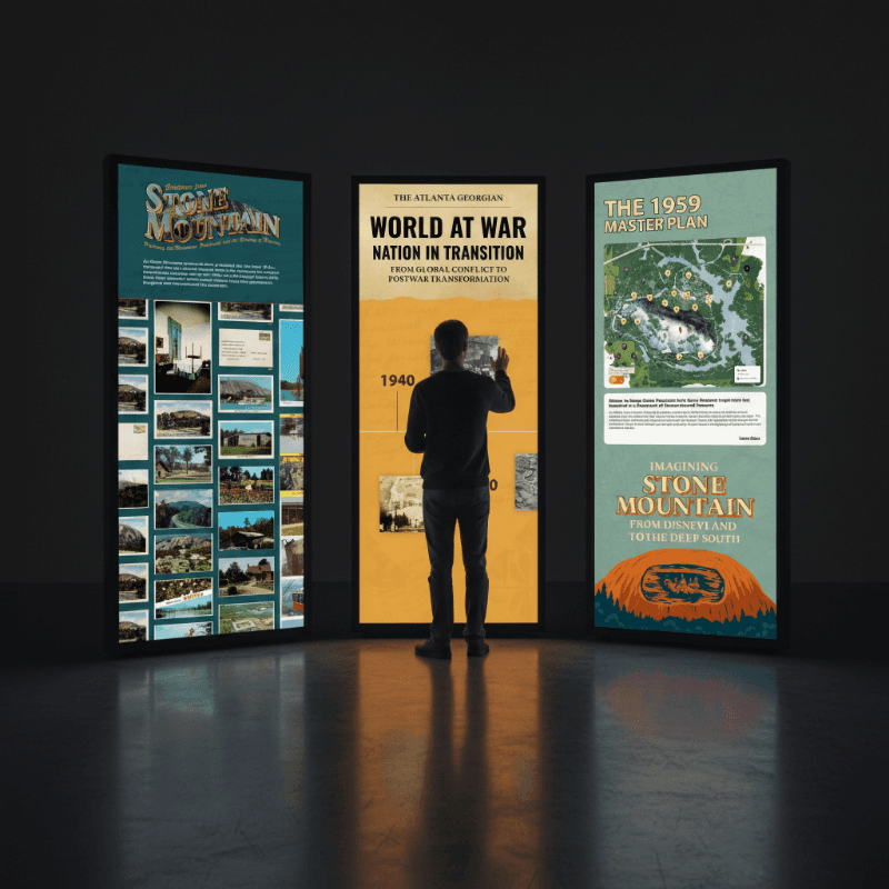
Museum archives and historical records are often dense, text-heavy, and difficult for general audiences to engage with. The core objective of this project was to take the complex, multi-layered history of Stone Mountain Park and transform it into an immersive digital ecosystem across three large-scale touchscreen kiosks (each a massive 2160px x 5120px resolution).
The product challenge was to design a highly intuitive, accessible UI layout that could captivate both young children and families. The goal was to collapse decades of historical archives, maps, and artifacts into an interactive layout that reduces cognitive load, encourages curiosity-driven exploration, and brings history to life in a physical museum space.
What I Had to Work With
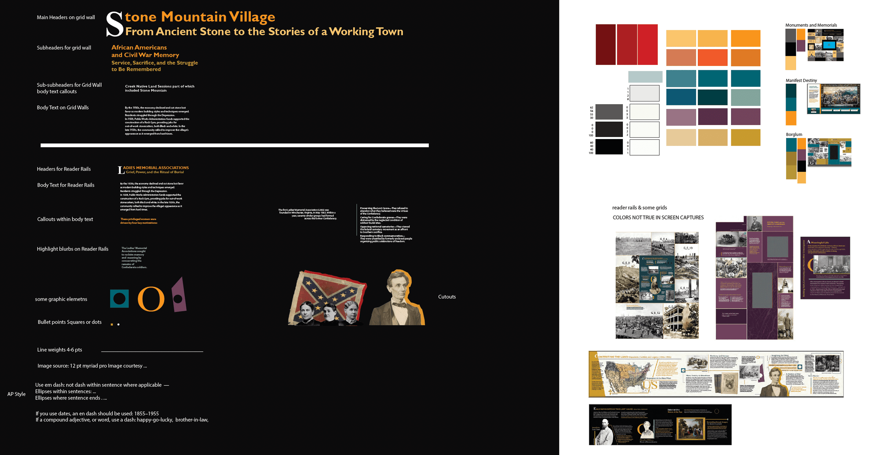
Strict brand guidelines. I had to work within rigid client color palettes (pictured above) and brand rules that lacked flexibility. Navigating these highly saturated, restrictive colors while keeping the interface modern and accessible was a major design constraint.
Too much information. The client provided an overwhelming amount of raw historical data, text archives, and imagery that they wanted visible on the screen. I had to architect a clean layout that satisfied their requirements without cluttering the viewport.
Screen height. Because the screens are exceptionally tall and mounted with specific wall elevations, human proportions were a critical constraint. I had to position interactive buttons and primary reading elements strategically within an average user's physical reach and eye level, ensuring the bottom and top boundaries remained accessible.
Cross-functional team. Serving as the intern and design lead for this project, I owned the creative direction and layout design. I balanced this responsibility while collaborating closely with a software developer and an experiential designer under senior leadership guidance.

Finding the Fix
The engagement barrier. Museum history can easily feel dry. Facing huge blocks of standard text causes visitors to instantly lose interest and walk away in public spaces. To capture passing foot traffic, the interface needed to lead with high-impact visuals rather than dense paragraphs.
Static content barriers. Displaying historical map changes and hundreds of vintage postcards in a boring, flat grid felt uninspired. To fix this, the interface needed motion-driven, hands-on interactions that felt interactive and tactile, encouraging visitors to naturally explore and discover the history on their own.
The Solution
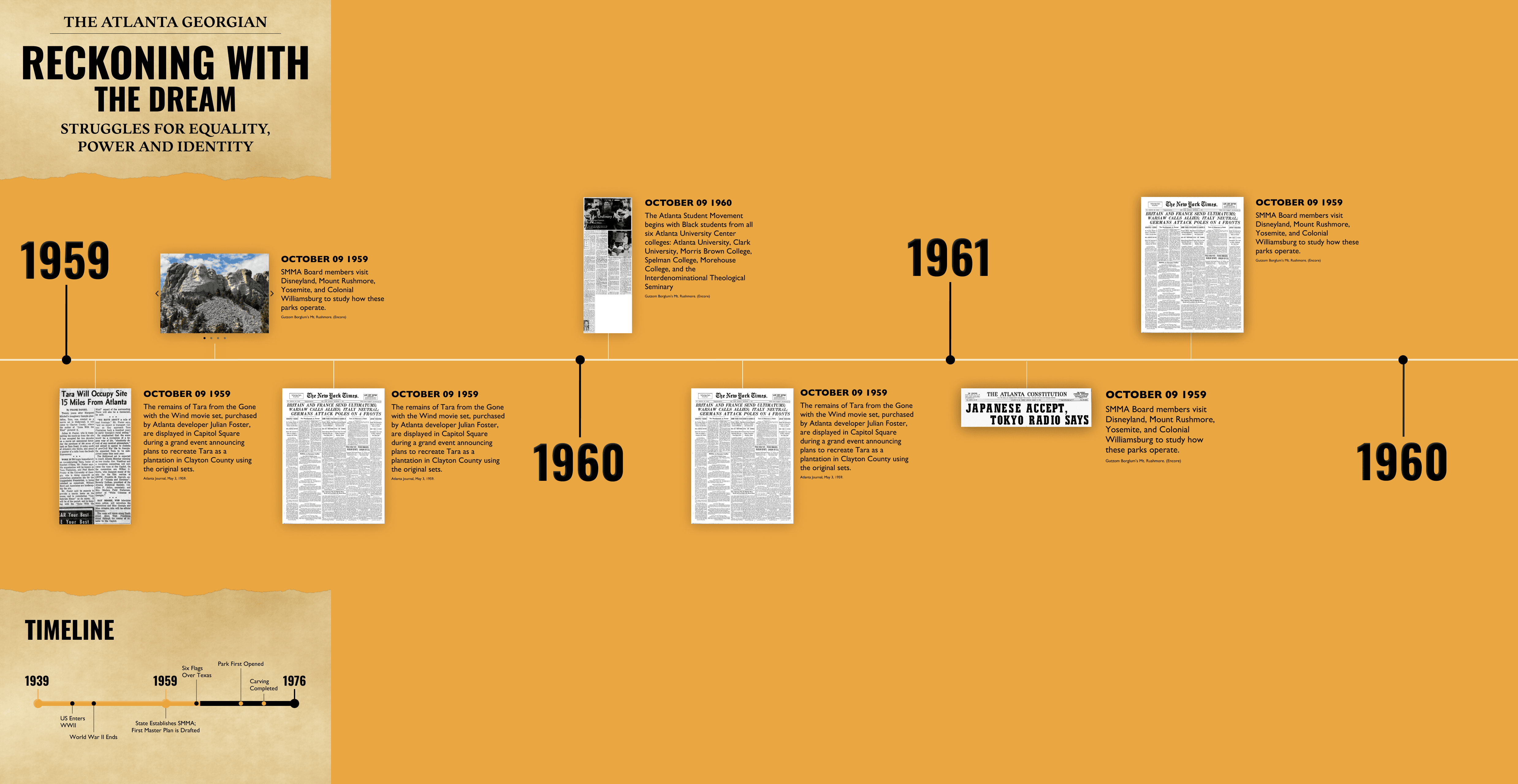
An interactive era timeline. I designed an intuitive horizontal timeline that allows visitors to scroll smoothly through the park's history. By placing high-contrast historical photographs as the primary focus, users are drawn into the story. The dense textual information is hidden behind clean modal layers, only opening when a user selects a specific image, keeping the core journey lightweight.
An interactive park map. I architected a responsive map screen that allows visitors to toggle between different decades. This lets users visualize geographical changes and the park’s growth over time in an intuitive, visual way.
An infinite postcard discovery engine. Tasked with displaying a massive collection of archive postcards that originally had zero descriptions, I turned a plain list into an interactive infinite-scroll grid. This gamified the layout, allowing families to fluidly discover and interact with historical insights through vintage visual media.
What Actually Happened
We operated on an 8-week production sprint spanning end-to-end design, client review cycles, and engineering handoffs. I pushed rough concepts into high-fidelity prototype layouts inside Figma, regularly presenting iterations to the client to align stakeholder feedback with experiential design best practices. Once the layout architectures were locked in, I ran continuous usability and testing loops alongside our developer to ensure all responsive touch targets and transitions felt fluid on the physical hardware before final deployment.

Final Outcome
The final deliverable successfully launched as a multi-screen interactive museum exhibit. By moving away from static text displays, the final interface design achieved key product goals:
Turning viewers into participants: The endless postcard grid and interactive map transformed passive viewers into active participants.
Making it accessible for families: Placing menu systems and touch elements within a natural physical height dramatically improved accessibility for families and younger children.
Organizing dense content screens: I successfully balanced and included every piece of historical data the client requested without cluttering the viewport, keeping the entire layout clean and easy to navigate.
Maximizing tight brand constraints: Despite working with a very rigid and difficult client color palette, I did my absolute best with the branding guidelines to ensure the final layout still felt modern and cohesive.

What I'd Do Differently
I would advocate for a re-engineered color palette: If given the opportunity, I would present data-driven color contrast studies to the client earlier in the project. Pushing for a more flexible, muted secondary palette would improve overall readability and reduce visual fatigue under harsh museum lighting.
What I Learned
Designing for large-scale formats: Moving from mobile app design to a 5120px tall physical canvas completely changed my understanding of scale. I learned to design with macro-level spatial awareness, ensuring typography and image resolutions stay sharp at massive scales.
Dev handoff precision: Working directly alongside a developer for a live physical environment taught me the immense value of precise asset handoffs. I learned to clean up design files, label components, and detail every micro-interaction to ensure the finalized code matches the initial design vision.