Interactive Karaoke Booth
Multi-style interactive singing interface for the Country Music Hall of Fame.
Experiential
Interactive Media
Role
Interactive Designer & Intern
Timeline
8 weeks
team
1 Enginner, 1 Senior Designer, 1 PM, me
platform
Interactive Exhibit
The Real Problem
The Country Music Hall of Fame needed an engaging, end-to-end user interface for their Taylor Swift Education Center interactive recording experience. The challenge was to transform low-fidelity wireframes into an intuitive, high-fidelity touchscreen application that museum visitors of all ages could walk up to and use without instructions.
The UI had to seamlessly guide users through selecting a song, understanding physical booth logistics (where to stand, how to record), previewing their performance, and easily exporting their custom music video via email or QR code. Additionally, the digital layout had to align perfectly with the physical space constraints, acoustic booth logistics, and hardware mounting requirements of the live museum exhibit.

What I Had to Work With
Low-fidelity wireframes. I was handed initial low-fidelity black-and-white wireframes mapping out the basic step-by-step recording flow.
Creative freedom. I was given full creative freedom to conceptualize the visual language, typography, and interactive components to bring the experience into a high-fidelity, polished prototyping stage.
Cross-functional collaboration. I worked within an agile creative team, collaborating closely with a senior designer to refine the layout system and adapt to shifting client demands under project deadlines.

Finding the Fix
Coming into the project, I wasn't deeply familiar with the deep history and visual tropes of country music. To make informed and intentional design decisions, I immediately jumped into exploratory research to understand the aesthetic landscape, ensuring the UI felt authentic to the museum's core theme.
Also, the Initial layouts were rigid and didn't allow for user personalization. In a high-traffic museum space, the interface needed to feel interactive and personalized to maximize visitor retention and enjoyment.
The Solution
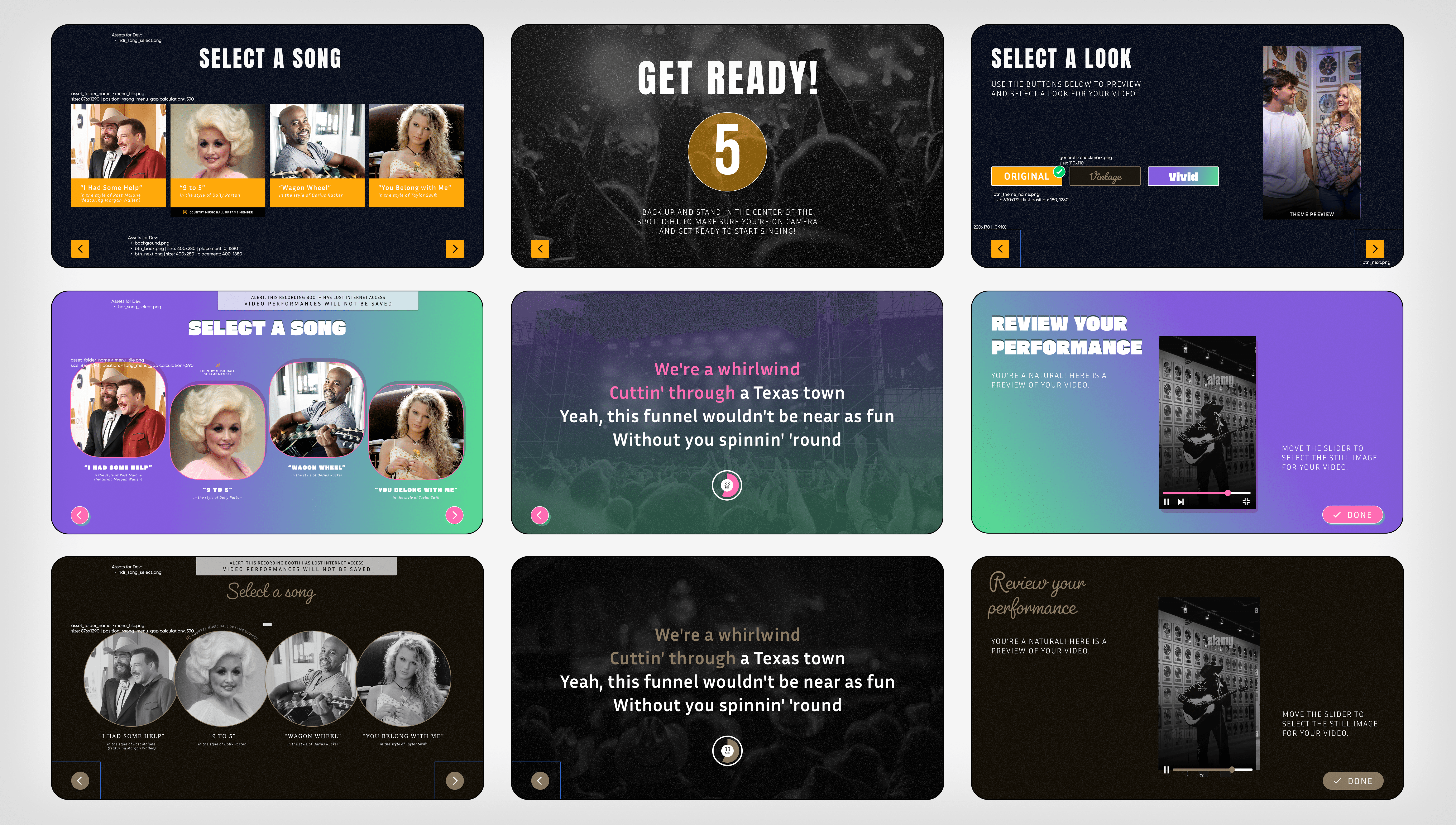
An intuitive recording journey. We broke down the complex multi-step recording process into simple, highly visual choices; using large, touch-friendly artist cards, countdown graphics, and video preview states that keep the user moving effortlessly through the journey.
Brand consistency. My primary focus was anchoring the core interface layouts firmly within the official Country Music Hall of Fame visual guidelines, ensuring the color schemes, typography, and messaging felt completely authentic to the museum's institutional identity.

What Actually Happened
We ran an iterative design cycle starting directly from the wireframe handoff. After presenting our first high-fidelity revision, the client requested a major feature: allowing visitors to dynamically personalize the entire layout style on-screen. Pivoting quickly, we jumped straight into creating multiple thematic UI component styles. I engineered the initial high-fidelity mockups for these dynamic themes, mapping out how the layouts would transition smoothly, then handed them off to the senior designer to finalize the system for development.

Final Outcome
The project successfully delivered a highly engaging, interactive recording installation that exceeded client expectations. By implementing the multi-style theme switcher directly into the layout, we transformed a standard recording tool into a customizable visitor experience.
The final high-fidelity screens completely removed navigation confusion, ensuring crowds at the education center could intuitively record, review, and share their performances.

What I'd Do Differently
I would establish a much faster research sprint at the absolute start of the timeline to familiarize myself with the niche domain data even sooner, allowing me to pitch thematic branding concepts to the team with more confidence early on.
What I Learned
Agile pivoting under shifting requirements. This project taught me how to take sudden client feature requests and quickly adapt my design workflow without losing momentum.
The power of collaborative handoffs. Working side-by-side with a senior designer to execute multiple UI variations taught me how to build clean, organized component libraries that make collaborative file-sharing seamless and efficient.