The Space Within Us Exhibit
Physical prototype to reduce overstimulation for neurodiverse students.
Concept Architecture
DESIGN PSYCHOLOGY
Role
Experiential Product Designer & Project Owner
Timeline
12 weeks
team
Solo Project (100% independent concept, strategy, UI design, and physical build)
platform
Interactive Physical Exhibit & Environmental Design
The Real Problem
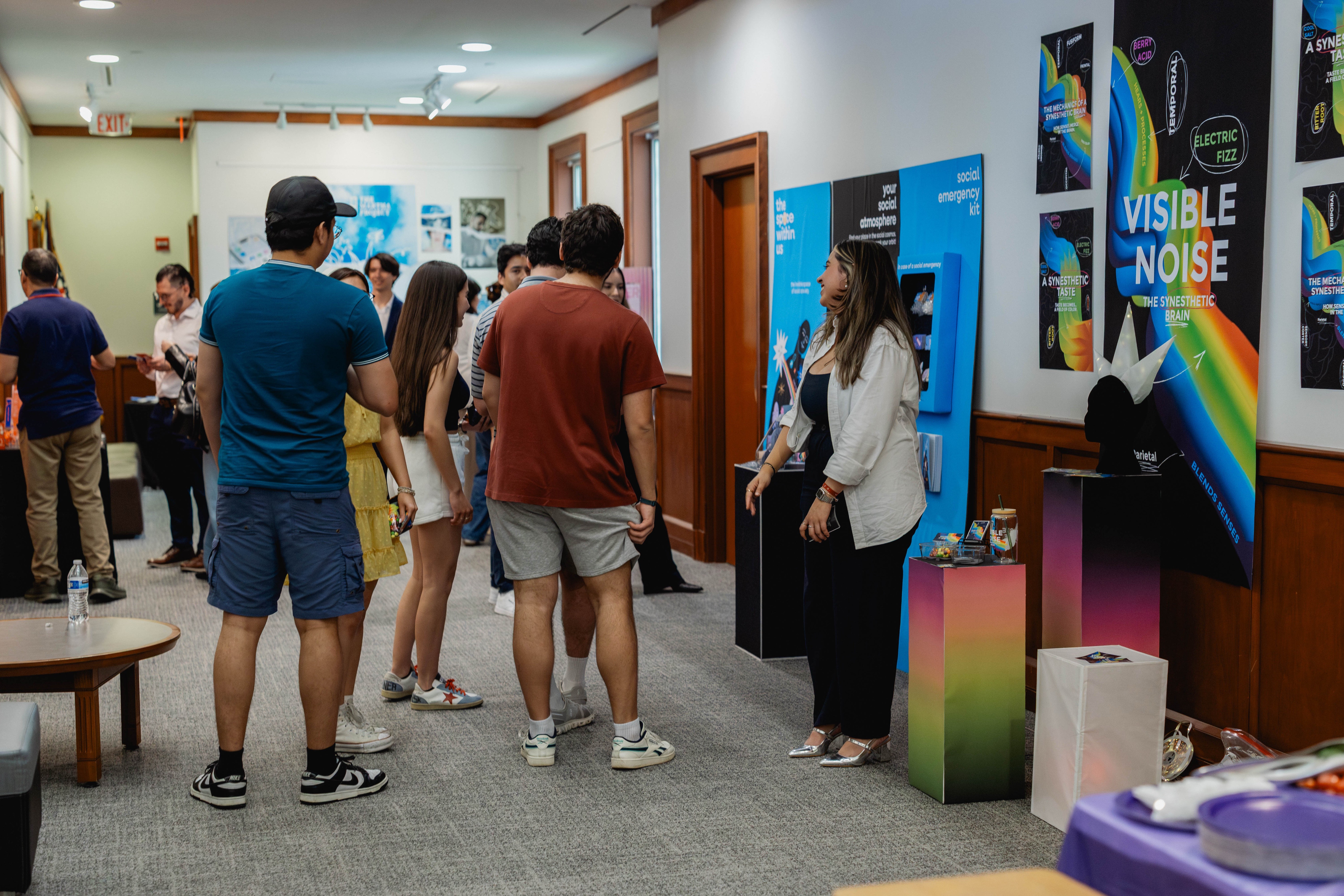
At Trevecca Nazarene University, "community" is traditionally measured by high-energy, vocal social participation. While this fosters deep connection for many, it simultaneously creates an invisible "participation barrier" that isolates neurodiverse students or those experiencing severe social anxiety.
The Space Within Us is a physical design exhibit I conceptualized, designed, and mounted independently to serve as a "safe harbor" on campus. Moving far beyond a standard art showcase, I engineered this space as a functional prototype to explore how intentionally designed environmental systems (using low-arousal color palettes, intuitive path layouts, and quiet, anonymous interaction loops) can significantly reduce anxiety metrics and create an accessible seat at the table for hyper-vigilant students.

What I Had to Work With
Tight spatial constraints. The university layout allotted me a small, limited space that was far from a traditional, wide-open gallery space. I had to think strategically about how to maximize every square inch to create an immersive, non-claustrophobic experience.
Minimal budget. The project funding was very limited, only covering basic raw materials like large-scale printing and foam core board. To achieve a premium, high-fidelity gallery finish without breaking the bank, I had to get incredibly creative with budget tracking and DIY solutions.
Shared timelines, solo execution. While I shared the overall exhibition deadline and presentation stage with four other students, I was entirely on my own to research, plan, design, and physically build my entire system from scratch.

Finding the Fix
Looking at how traditional college campuses handle connection, I realized that standard social spaces are loud and demanding. To fix this, I needed to design a low-friction layout that allowed users to transition smoothly from an overstimulating hallway into a protected, calm environment.
Besides, I also needed to figure out how to display heavy mental health narratives alongside physical takeaways without cluttering the visual field. The structure had to feel like a seamless physical user journey without overstimulating the participant.
The Solution
An experiential safe harbor for anxious students. I architected a multi-sensory environmental prototype focused on human comfort. By using a low-arousal color palette , soft lighting, and hand-drawn visual assets, the exhibit felt like an approachable place rather than a clinical art display.
Zero-pressure interactive loops. I built passive interactive features where visitors could choose their own level of engagement. Instead of forcing vocal communication, students could connect anonymously through tactile elements, proving that quiet presence is still active participation.
A tangible treatment zone. I designed a custom self-service station packed with free, hand-crafted mental health takeaways. Visitors could grab items specifically designed to calm anxiety in real-time, giving them a comforting, physical tool to carry back out into loud campus spaces.
What Actually Happened
Planning: The project kicked off with 4 weeks of deep planning and academic research to solidify the psychological foundation of the space.
Feedback loops: Once the initial concept pitch was approved, I moved into the branding and logo design phase. This stage took the longest because I had to manage multiple rounds of critiques and align feedback from a diverse group of stakeholders, including university administrators, professors, and fellow participants.
Production: Because the extensive stakeholder alignment process pushed our timelines back, I was left with a high-pressure, 3-week window to finalize every single interface design, print the materials, hand-assemble the deliverables, and completely build and mount the physical structure in time for the live showcase.

Final Outcome
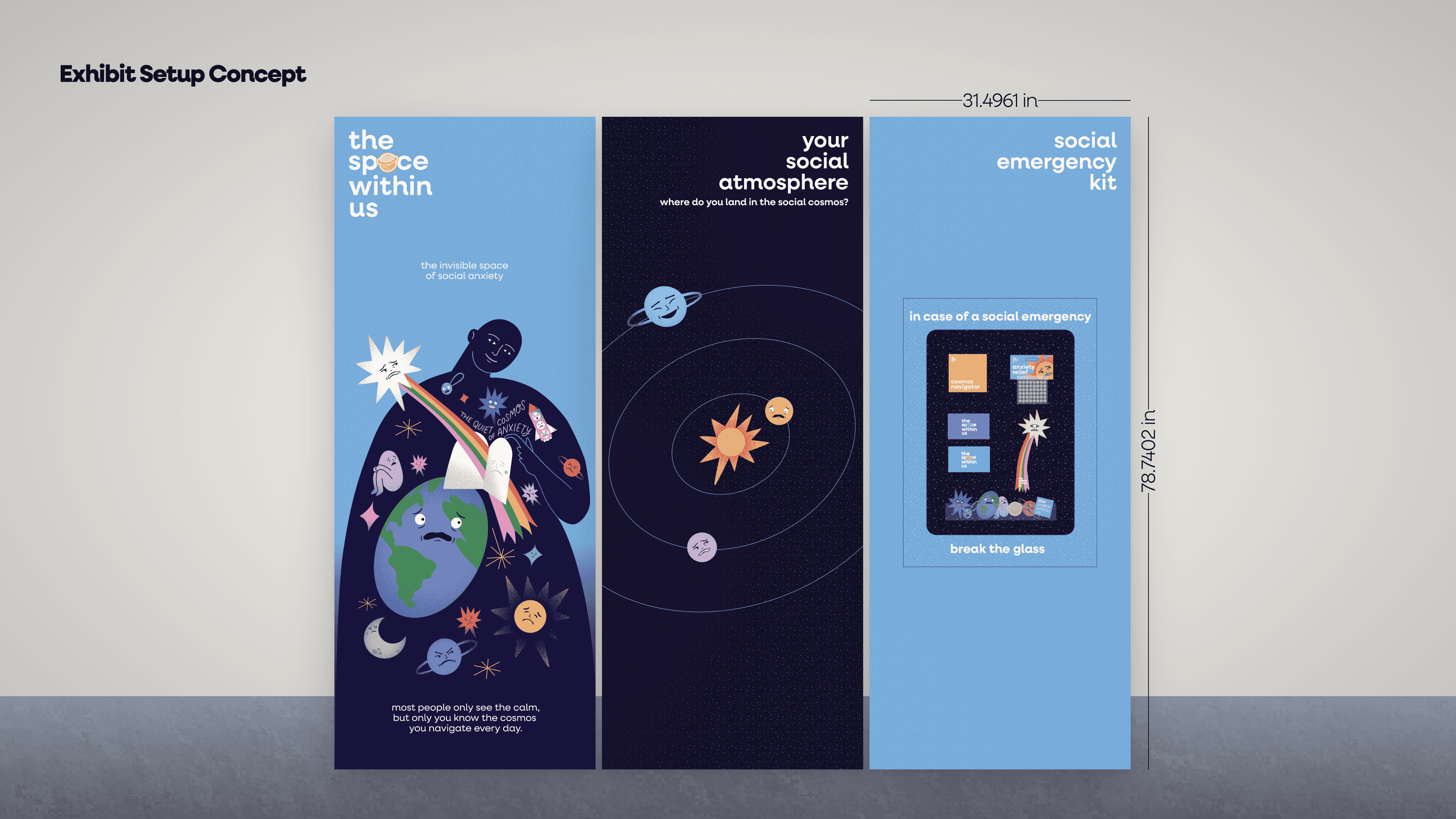
I successfully built and mounted an interactive, three-panel environmental display (each standing 30 inches wide by 75 inches tall) mapping out a distinct user experience:
Panel 1: The awareness wall (Left): Introduced the core research and metaphor of the exhibit: that social anxiety is not just a "feeling," but an entire internal universe that we navigate while appearing "calm" on the outside.
Panel 2: The diagnostic feedback wall (Center): Acted as an anonymous data collection loop. Visitors could visually self-report their current mental state by grabbing a sticker and placing it in a specific group based on how they felt: Very Anxious, A Little of Both, or Very Social.
Panel 3: The treatment zone (Right): A creative product display showcasing my hand-crafted mental health deliverables; including affirmation cards, bookmarks, journals, stickers, and custom "Stress Relief" bubble wrap pill packets. I displayed these in a custom self-service frame under a creative and intuitive headline: "Break Glass in Case of a Social Emergency," turning anxiety into a playful, relatable moment of relief.

What I'd Do Differently
Source higher-end materials. If given a corporate budget, I would love to step away from foam core and utilize permanent, premium architectural materials like frosted acrylic glass, custom woodwork, and built-in LED ambient backlighting to create a truly seamless professional finish.
Extend the prototyping timeline. I would establish rigid design deadlines earlier in the process to give myself a larger window for test-printing, color-calibration checks, and pre-assembly testing before the final gallery build day.
What I Learned
Physical prototyping has a high learning curve. This was my absolute first time taking a two-dimensional design system out of the digital and translating it into a physical, three-dimensional interactive space. Learning how scale, lighting, and printing materials behave in the real world was a massive, invaluable technical lesson.
Project management under pressure: Managing the end-to-end product lifecycle (from managing conflicting stakeholder feedback to hand-fabricating multiple physical assets under a tight 3-week deadline) completely solidified my project management style and proved I can deliver high-impact results with minimal resources.