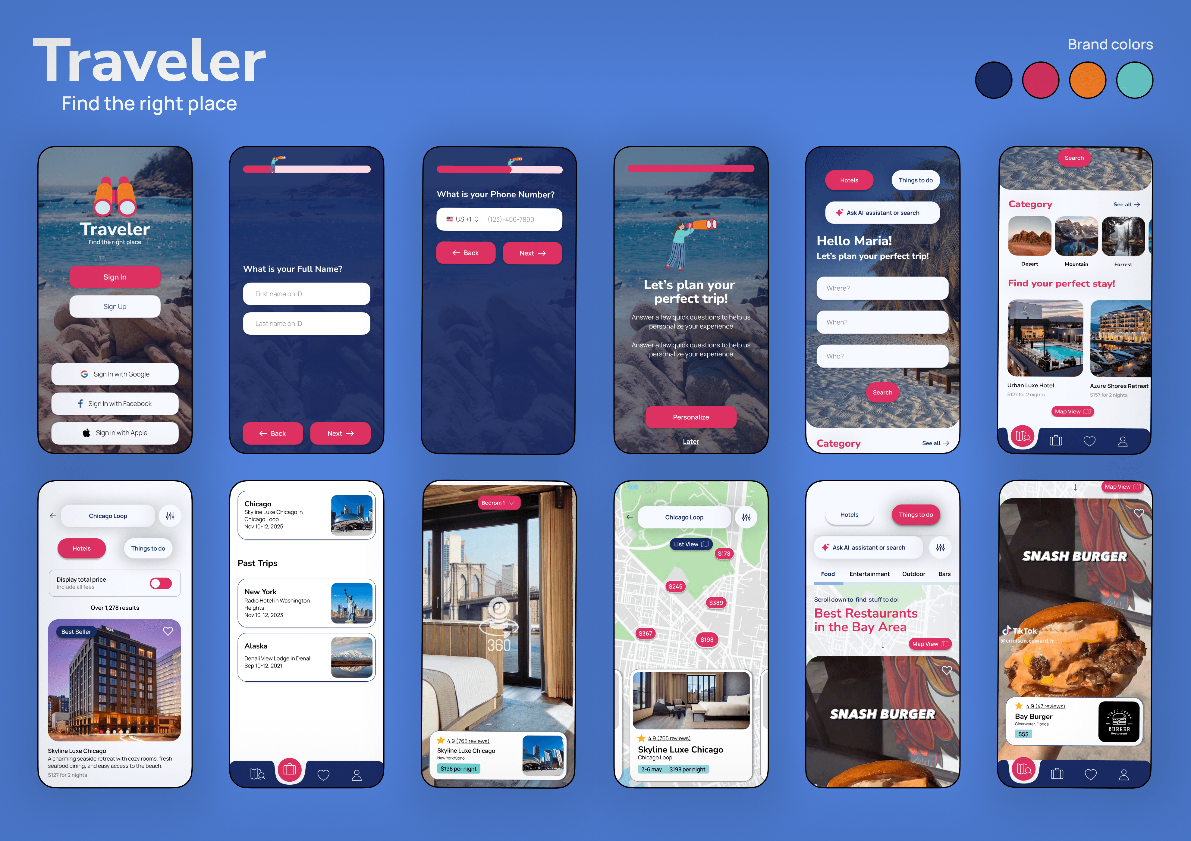
Traveler App
Next-gen travel planning powered by personalized AI integrations.
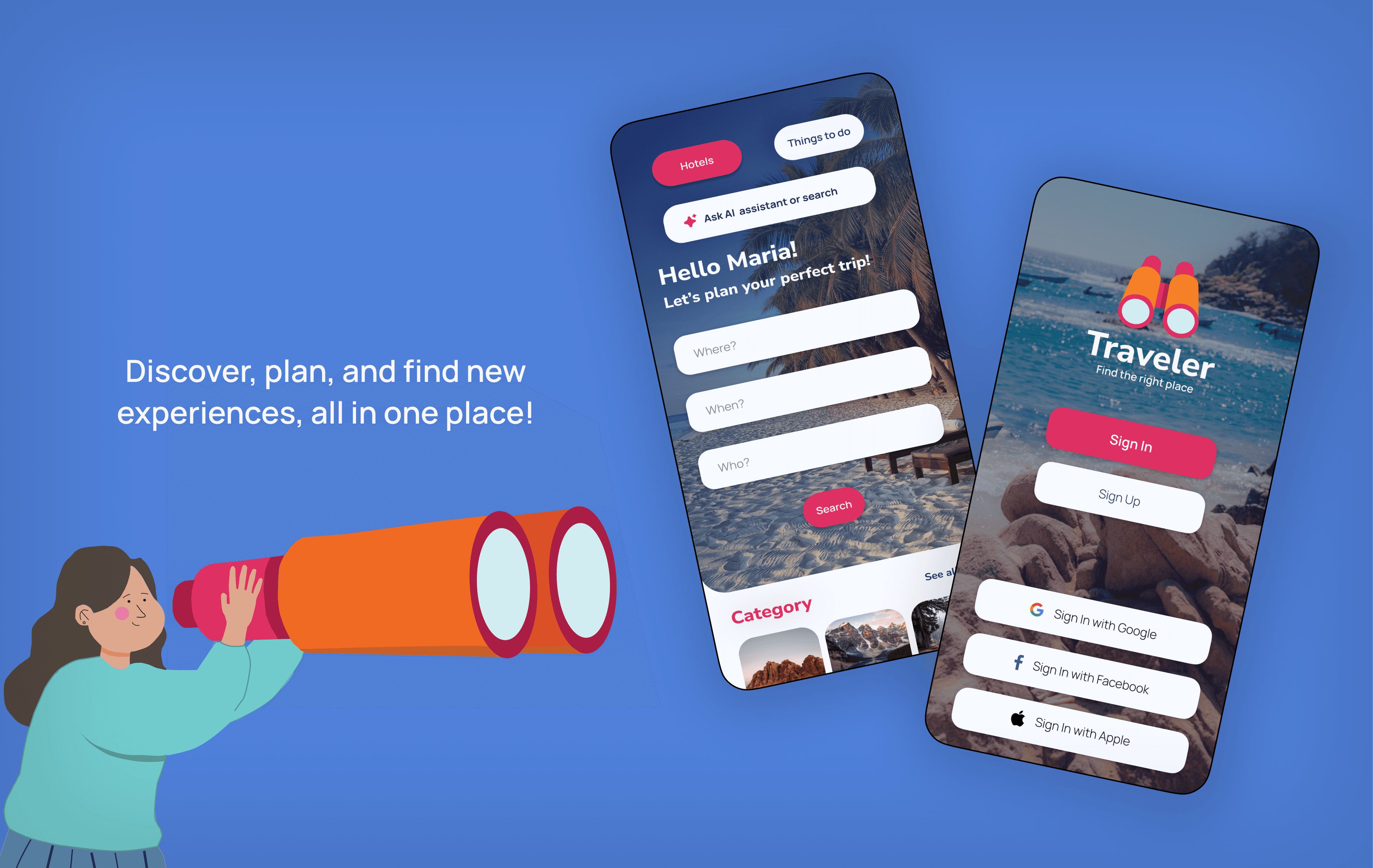
Mobile App
Product Strategy
Role
Product Designer
Timeline
8 weeks
team
1 Graphic Designer, me
platform
App

The Real Problem
The online travel landscape is completely broken up. When you plan a trip, you are forced to bounce between a million different apps: search engines to look up destinations, short-form video apps (like Instagram or TikTok) to find cool itineraries, and booking sites to lock down hotels. This constant jumping back and forth creates massive frustration, and it is incredibly easy to lose track of what you found.
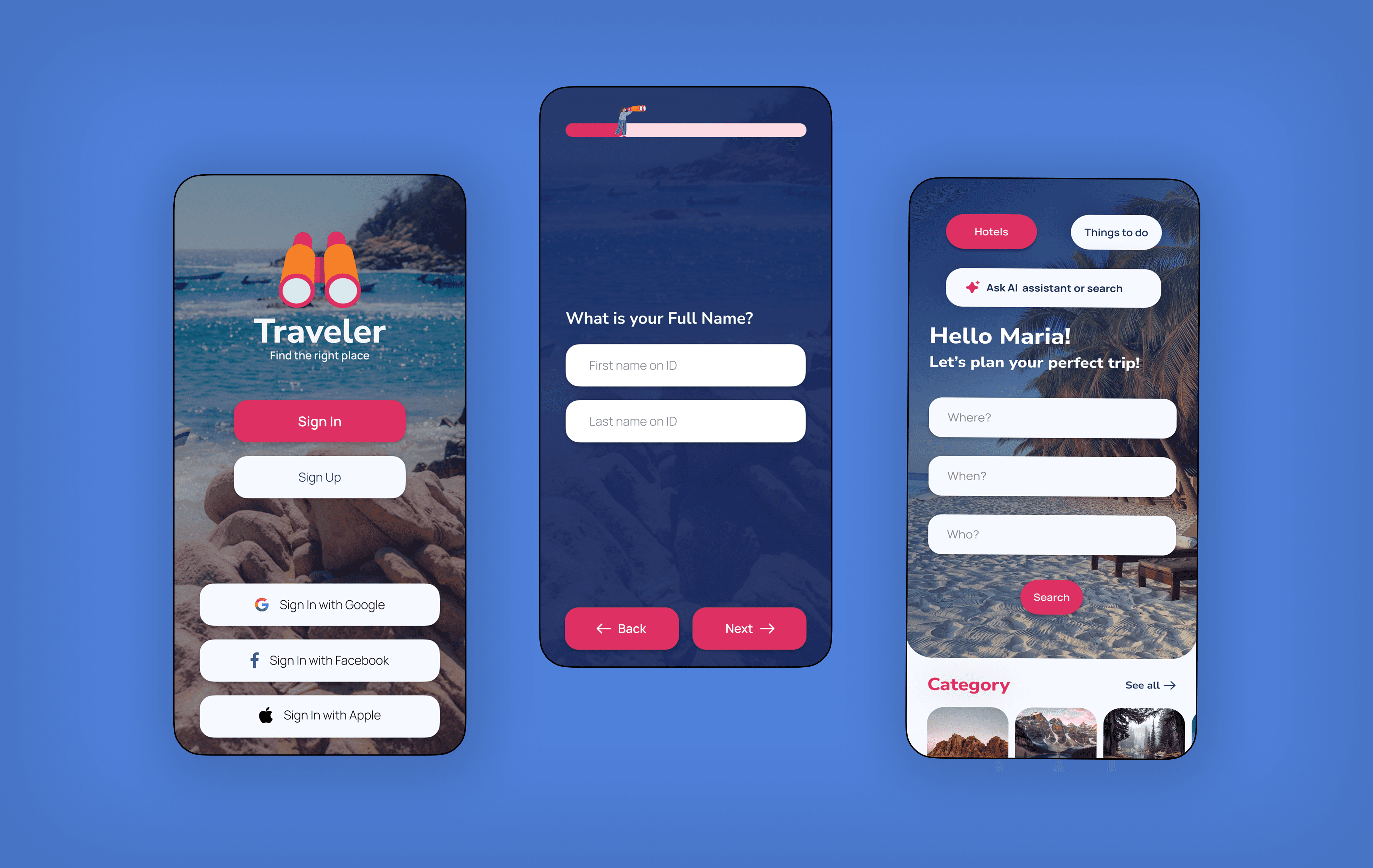
The core product challenge was to design a unified mobile app that handles the entire user journey. We wanted to take a user smoothly from that first spark of visual inspiration all the way to planning, collaborative group sharing, and final booking checkout in a single, high-retention interface.
What I Had to Work With
We had fragmented user data. We didn't have live, internal analytics from actual app users. Instead, I deep-divived into secondary market research, platform benchmarks, and competitive design systems across the hospitality and social media sectors to map out core behavioral patterns.
Our multi-feature scope was complex. The application needed to seamlessly combine an immersive video engine, an interactive mapping system, an AI-driven recommendation feature, and a transactional checkout system for booking.
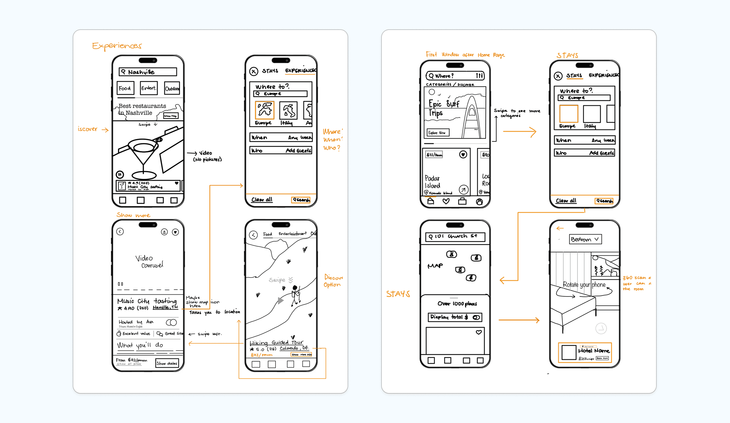
The system had to stay clean and easy to navigate. Balancing data-heavy layout blocks (like room amenities and pricing) alongside heavy media assets (video feeds and 360-degree virtual tours) required strict visual discipline so the screens never felt cluttered.
Finding the Fix
I wireframed the app flow to identify exactly where people get stuck or abandon the planning process. After the test, I also evaluated competitor layouts, and three major system pain points stood out:
Users had to manually sort through endless filter forms and inventory lists, causing instant decision fatigue.
Users trusted video proof over text reviews, forcing them to leave booking apps to see real video layouts on other platforms.
There was no seamless way to save discoveries, organize an itinerary, and collaboratively edit plans with a travel group.
The solution
Consolidating our product, by building a centralized digital app that merges inspiration, itinerary planning, and booking into a single user stream.
Integrating a localized video feed with interactive map-view overlays, allowing local businesses to organically engage and convert users via short-form video ads.
Designing an automated AI framework that instantly builds custom itineraries and applies filters based on user preferences.
What Actually Happened
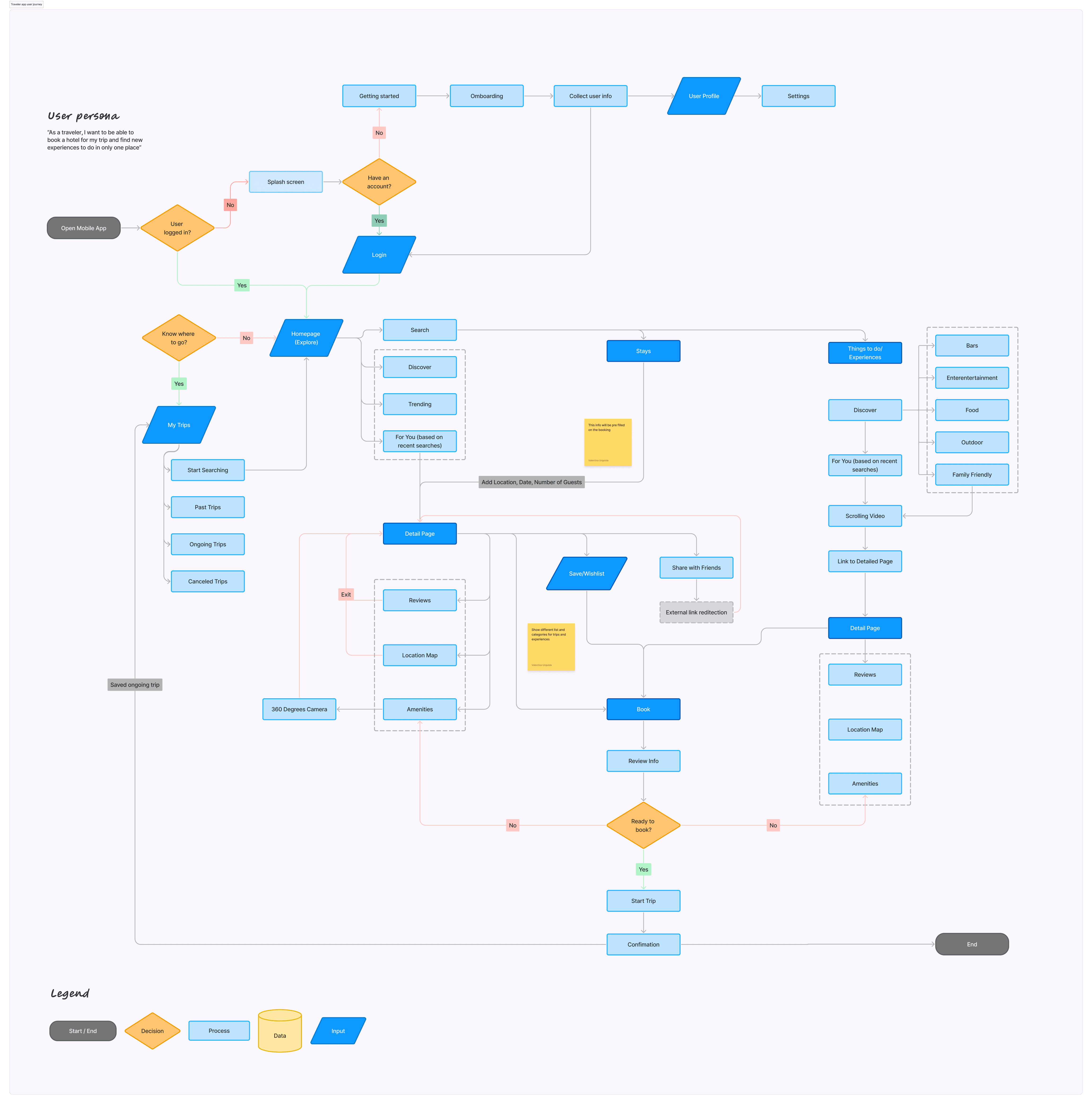
I began by structuring an intuitive user flowchart to map out the fastest, most seamless pathways to booking checkout. Using these models as a blueprint, I transitioned from rough layout sketches to scalable, high-fidelity, responsive components in Figma.
Because this was a collaborative project, our team built component libraries and global styles to ensure absolute visual consistency across every interface layer. For the design system, we selected a strategic color palette tailored to engage a younger audience (evoking a sense of vibrant adventure and brand trust), paired with clear typographic hierarchies that maximize readability across complex booking details. Finally, we put our design to the test, running usability checks with our peers before successfully pitching the finalized product prototype to a panel of 28 stakeholders.
You can try our prototype here.
Final Outcome
By centralizing the fragmented travel workflow, the final product design achieves massive strategic goals:
Reduced task time. Combining trip destination discovery and checkout into one app eliminates multi-platform switching, drastically shortening the user journey from inspiration to booking.
Optimized merchant visibility. The integrated video ad feed provides local businesses with an immersive, targeted marketing loop that naturally drives user engagement and conversion metrics.
Validated product value. The inclusion of collaborative group-sharing and real-time editing features converts the app from a single-use transactional utility into a high-retention social app.
What I'd Do Differently
While our secondary market research gave us a solid foundation, I would love to back it up with primary data like user surveys or direct interviews. Testing our assumptions against real user metrics would help ensure the pain points we focused on completely align with what travelers experience in the real world.
What I Learned
An all-in-one experience beats single features. Successfully combining short-form video discovery with a booking checkout proved that fixing the entire user journey delivers way more value than just tuning up a standalone booking tool. Solving the whole problem is what keeps users from leaving the app.
Design must serve the user's goals. Visual choices can’t just be about looks; they have to help the user get things done. Choosing a vibrant color palette that is more engaging to a younger audience while creating trust, and creating clean layouts directly keeps users from getting frustrated and quitting mid-task.
Early team alignment speeds up handoff. Working collaboratively under tight deadlines showed me how important it is to have quick, constant feedback loops. Creating a unified component library early on kept our team completely aligned, making it seamless to deliver a complete, developer-ready prototype to our stakeholders.